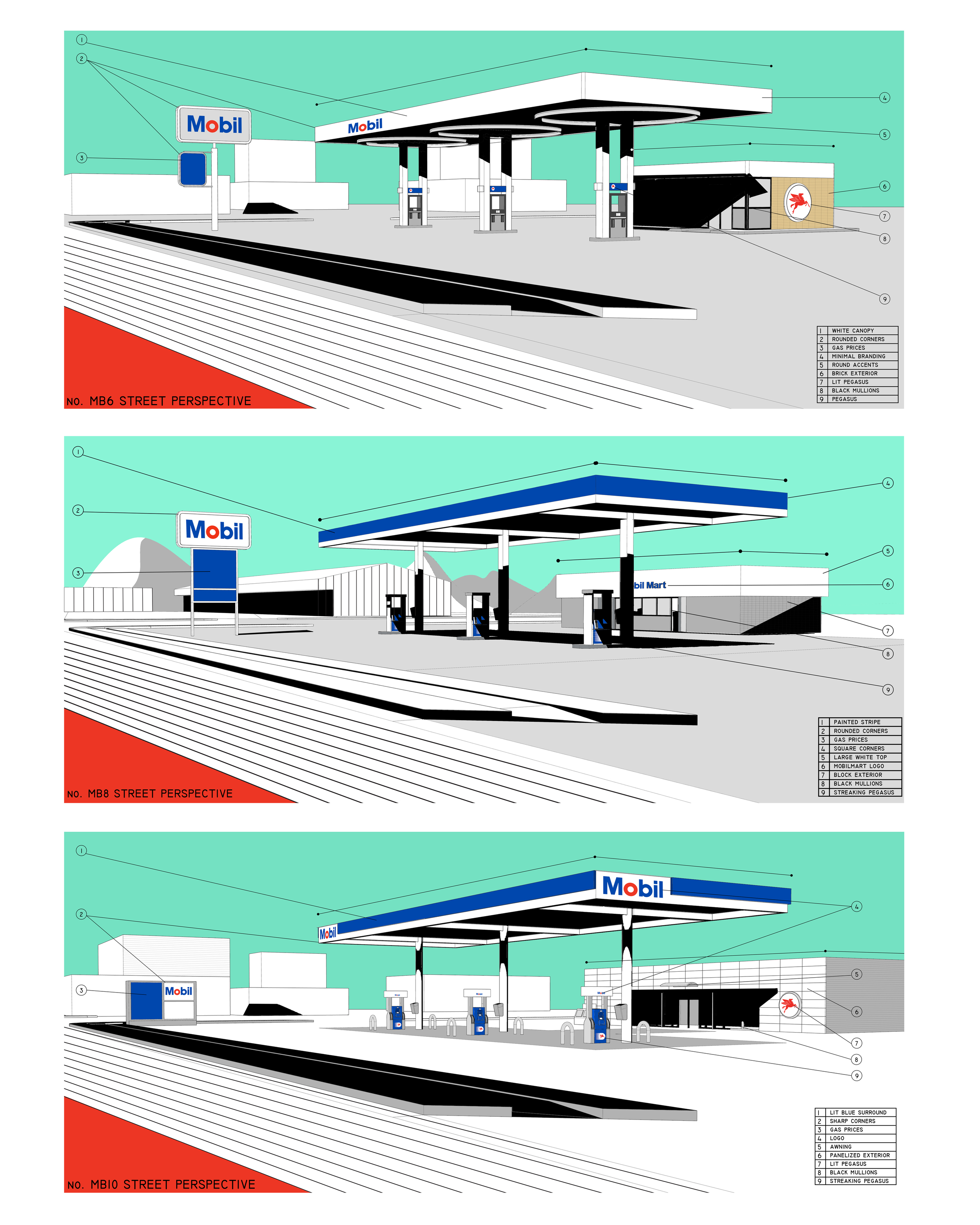
Mobil
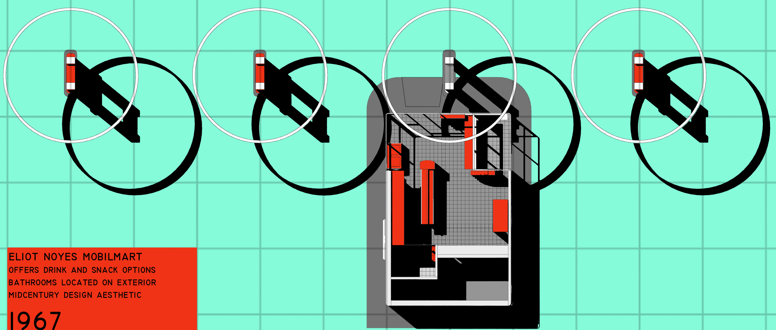
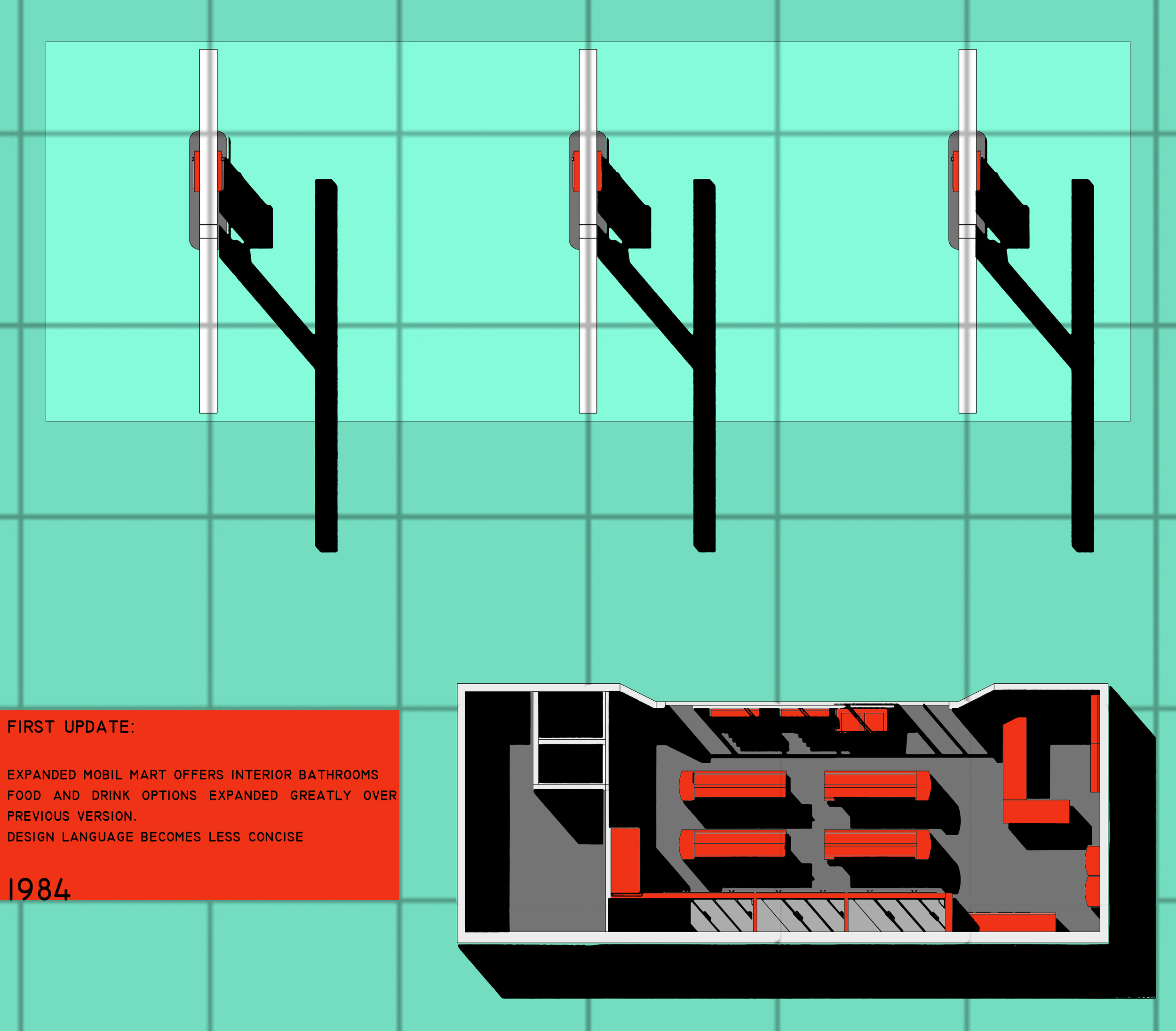
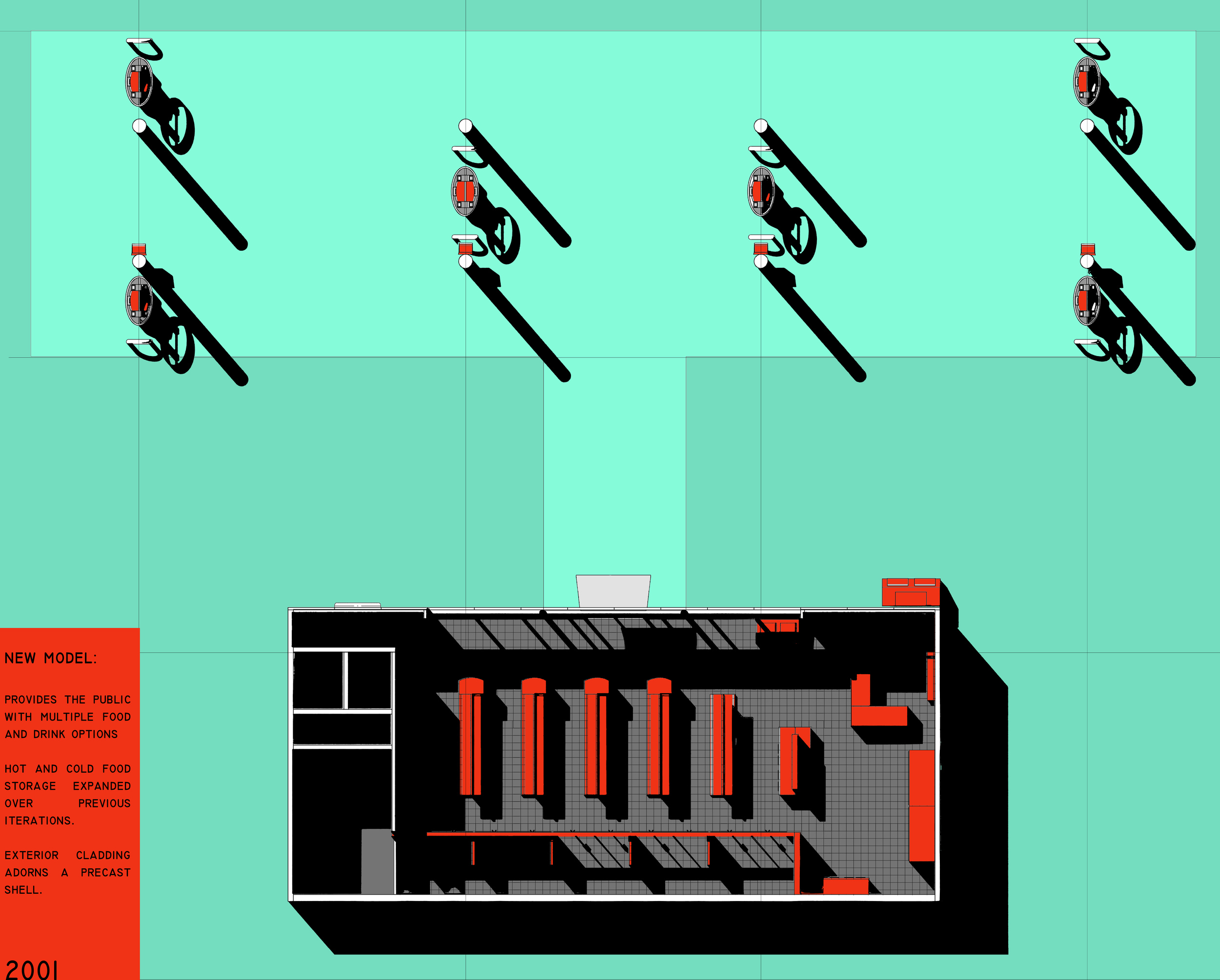
Mobil, as a brand has a long history of design. Their iconic Pegasus logo, used in the beginning of the 20th century was integrated into a full branding standardization in the 1960’s. This identity, by Eliot Noyes would become the standard for many decades and influence branding strategies across the world. As gas stations have transitioned to more comprehensive rest stops, their layout and design has been lost in favor of square footage, the contents becoming much more important than the container.
This project began through graphic research of existing conditions, both as a way of understanding programatic elements of the gas station, but also to create an index of the adjustments and ongoing changes to the program and design of gas stations over time. This research thus provided the foundation for a redeployment of new Mobil stations in ways that become more aware of their function and surroundings.

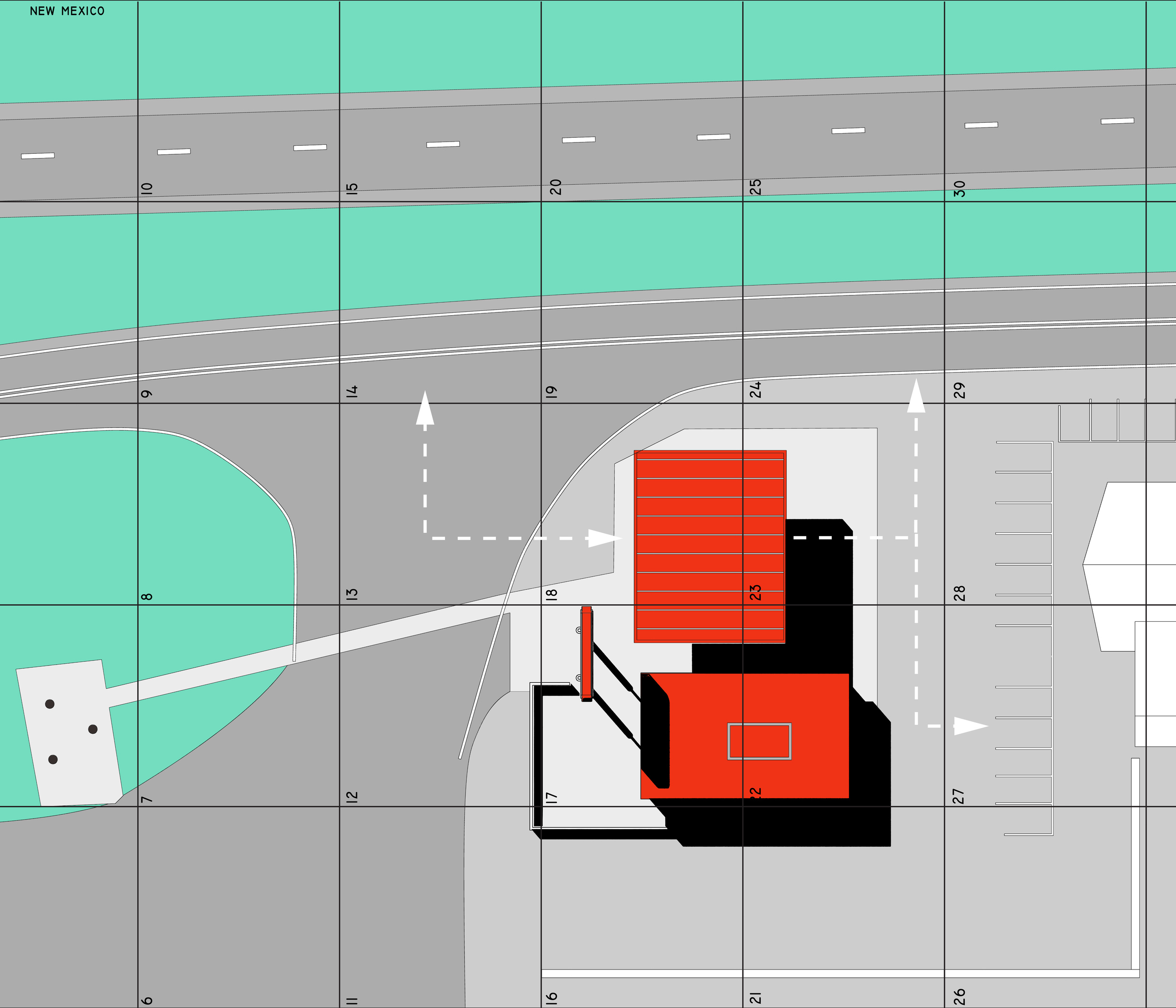

This project looks to bring a functional art object to the barren west texas landscape. By locating the project on the route to Marfa, this gas station interacts with a variety of people from across the country, as well as the native texans that call Presideo county home. Through a careful curation and reappropriation of materials and geometries native to the oil drilling vernacular, the station sticks out from the barren landscape while providing both a much needed service, and familiar design language.

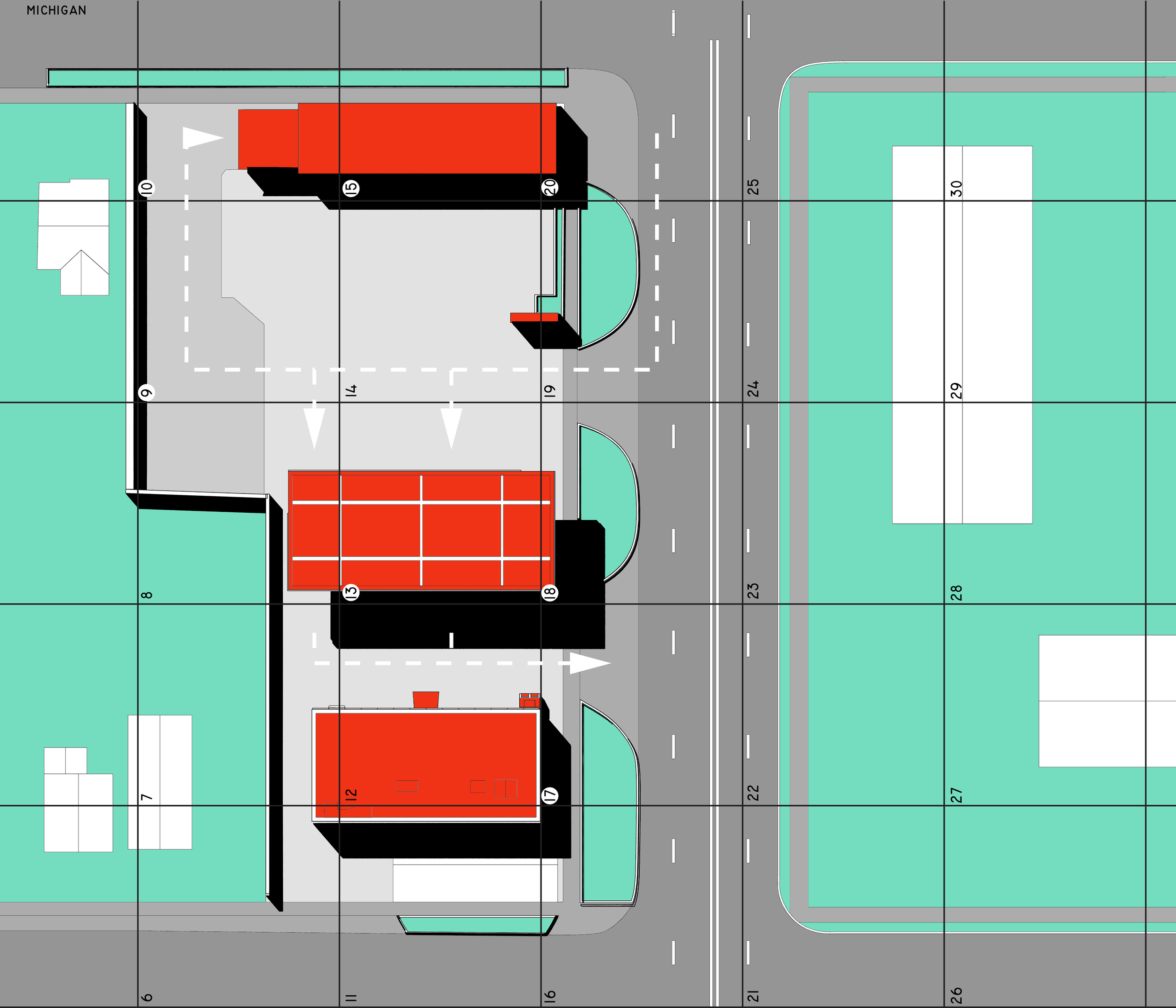
Infrastructure is a necessary part of life in a metropolis such as New York City. Often, these systems are buried underground, or relegated to the outskirts of the city, hidden in unadorned boxes. Subway ventilation is a system that must exist above the subway lines, thus posing a design problem in the heart of the city. The site location, in Greenwich Village was chosen as it is currently in the construction phase of a new ventilation plant.
The idea that these necessary pieces of technology are to be hidden away from the public eye is something that is challenged in this project. By exposing and articulating the ventilation plant, a new conversation is born, one that can acknowledge the existence of these systems. This project then inserts public service into this private structure. A gas station, car charging/storage lift, bathrooms and an elevated park all bring new streams of revenue to the site, which otherwise would lack any public function. Gas stations in New York City are disappearing, as sky-high land values mean it is more lucrative to sell the land than to stay open. This looks to rectify that issue.

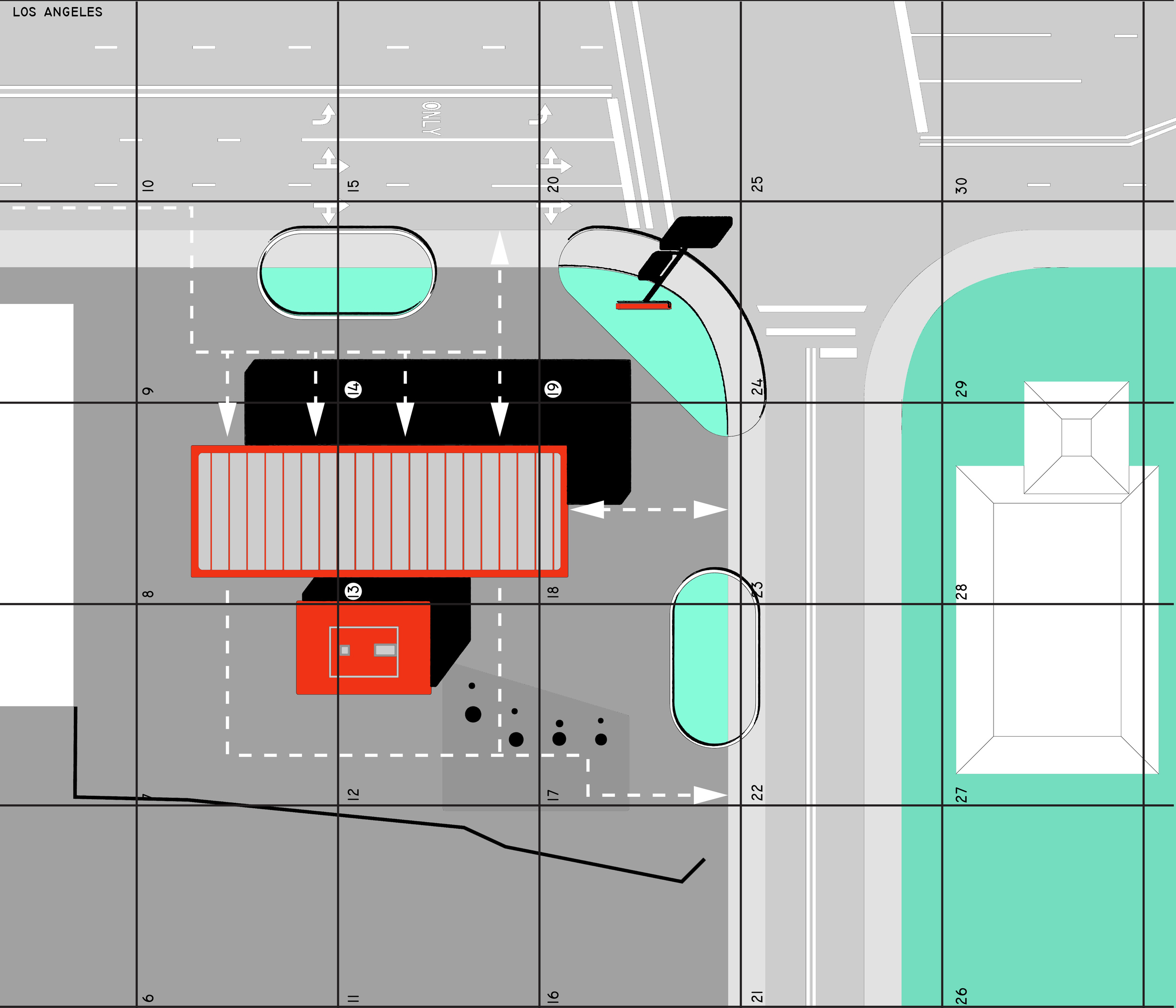
The interstate gas station is one that was borne out of necessity to travelers, providing an oasis in an otherwise open landscape. The utility of the gas station takes precedent over design language and each one becomes easily navigable and underwhelming at the same time. The design for this station, outside the Bonneville Salt Flats takes its design language from its surroundings; surroundings that have a rich history of speed, technology and innovation. The salt flats, famous home of land speed records, and the nearby Wendover Air Force base, home to the atomic bomb carrying Enola Gay, are both within miles of this station. Their impact can be seen in the design language of the station and its layout. A patterning and tracing of the pipes and lines that connect the structures is also undertaken. This graphic application is further applied to other pieces of information scattered about the site. These graphics provide additional visual information to the travelers, elevating an otherwise mundane experience. Solar picnic canopies, water reclamation and an observation tower are all integrated within this station.